Using Colour to persuade
“Everything is connected to everything else.”
Colour is a powerful tool that can enhance any presentation. Research shows that colours can evoke an emotional response and make your message more memorable and persuasive. However the psychological impact of colour can also ruin your persuasive message, so think carefully about your choice of colour.
A simple but effective technique to make a presentation to a company more persuasive is to use the colours they use in their branding or in their in-house presentations. This makes your message more persuasive because it seems to fit with how they do business and improves your rapport with them. But when matching colours make sure you use the correct colours. A simple and free tool that will save you hours when matching colours is called instant eyedropper: http://instant-eyedropper.com.
There are various ways of incorporating colour into your presentations, but you need to be mindful of the emotion and logic of colour when choosing.
Look at this example:
We suggest that persuaders:
- Use more black
- Try for a twosome or a trio of colour
- Choose culturally appropriate colours
Use more black
Having suggested that colour is important, we begin our discussion with black. The use of black is more powerful than people recognise and the techniques surrounding the use of black have implications for the use of other colours.
As a starting point, we suggest that you design a visual that is effective in black and white, before adding colour. If the visual makes a big impact in black and white, then it will be even better with a splash of colour. In contrast, a rainbow of colours tends to emphasis nothing in particular.
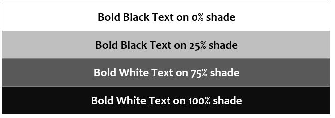
When using black, it is useful to introduce variety through shading. Our design standard incorporates four shades: 0%, 25%, 75%, 100%. Two of these need bold black text and two need bold white text. Adding one other design element, using a 50% shade for the lines instead of black, produces a simple and powerful design element. The table below shows the combinations and the contrast with a 50% shaded line.
The best way to learn about colour is to experiment. Try using 50% shading for the lines in your tables instead of 100% black. Use some white text on 100% black.
If you are interested in the elements of graphic design, Roger Parker explains these well in his book Looking Good in Print.
Try for a Twosome or a Trio
With colour, the key is sparing, well-considered use. We recommend using three colours or less on a visual. While colour provides opportunities for creativity, colour should be used to enhance your message, not simply to decorate it.
The default on most programs that create charts - Excel®, PowerPoint® and Visio® - will produce charts with a rainbow of colours. However, fewer colours are usually more effective. The most effective number of colours, judging from world flags, seems to be three. Remember, a rainbow of colours emphasises nothing.
Choose Colours for the Culture
The emotions triggered by various colours are culturally specific. In this sense, culture could refer to the culture of a country, an industry, a firm or even a department.
Barabara Munter, in Guide to Managerial Communication, explains that death is symbolised by black in most Western cultures, white in many Eastern cultures, yellow in many Muslim cultures and purple in parts of South America. Choosing the wrong colour might mean the death of your persuasion.
Similarly, using the theme colours of your audience’s rival may create the impression that you are not trustworthy, or that you don’t understand their business. For example, it would be ill-advised to base a presentation to Pepsi on a red and white colour theme.
The Emotion and Logic of Colour
Persuasion needs both emotion and logic, to influence the heart and the head. Therefore, we must investigate the emotional and logical impact of colour.
The Emotions of Colour
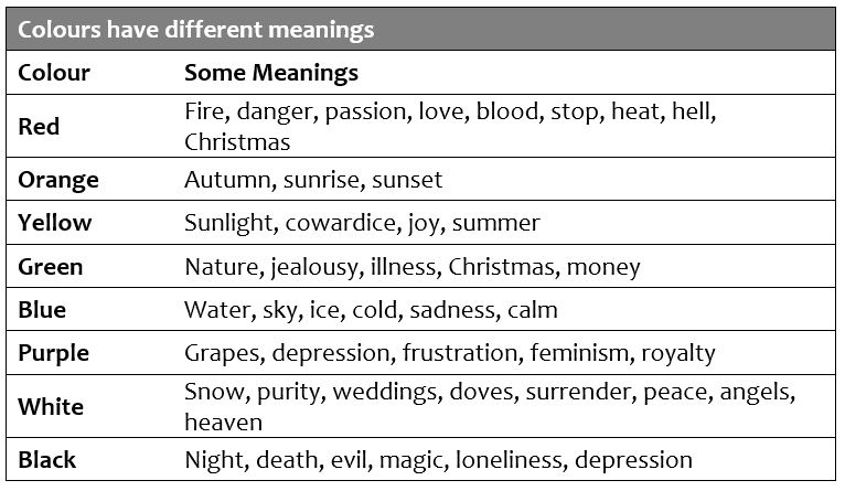
The emotions triggered by colour are culturally specific. For example, in the West, red stands for danger, whereas in China it represents joy. Some of the possible meanings linked to colour are given in the following table.
The meanings assigned to colours also vary between professions, as shown in the table below.
The Logic of Colour
A Xerox Corporation study showed that business documents in colour were read 70% quicker than documents in black and white. Also the study found that recall error for the coloured documents was 39% lower than for black and white documents. The research found that most business people interviewed agreed that the proper use of colour increased their speed, accuracy and comprehension of material.
Ronald E.Green in his article The Persuasive Properties of Colour argues that colour in presentations:
- Accelerates learning, retention and recall by between 55% and 78%
- Improves and increases comprehension up to 73%
- Increases recognition up to 78%
- Increases motivation and participation up to 80%
- Sells (products and ideas) more effectively by 50% to 85%
Choosing colour combinations
To choose effective combinations we first need to understand the colour wheel. The wheel shows colours and their relationships. There are many possible colour wheels, but we will use a simple six colour version. The wheel has three primary colours (red, yellow and blue) and three secondary colours (orange, purple and green).
The most effective colour combinations are:
- Colours next to each other on the wheel
- Colours opposite each other on the wheel
If you want further information, Rob Carter’s book Working with Computer Type: Colour and Type (1996) is a good source. Rob Carter devotes 50 colour pages to illustrating many of the combinations of text and background. Flicking through the pages shows the impact that different combinations create.
When combining colours, remember that 5% of the population are colour blind. Keep this in mind when using:
- Brown & Purple
- Blue & Purple
- Blue & Black
- Red & Green
Even though some of those colour combinations are very effective, you should be aware of the difficulties faced by a colour blind audience member, if you use those colours.
In summary, our suggestions are:
- Use a twosome: shade with white; tint with black; pure colour with grey.
- Alternatively, use a trio: colour, shade and black; colour, tint and white; black, white and grey.
- Use colours next to each other on the wheel.
- Use colours opposite each other on the wheel.
Finally, if you want a quick way to test colours, have a look at the colour match website (www.colormatch.dk). On this site you can make any colour from three primary colours and then see a palette of complimentary colours. We find this is a fast way to experiment with colours and find a palette to produce a theme for your presentation.
Colour is one of the most powerful factors to consider when presenting. Experiment with those that suit your company and the companies you are presenting to.


